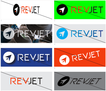
For as long as there have been ads, there has been a tug-of-war between branding and getting a response.
If your ads all look the same, they run the risk of not resonating with users. That can lead to low response rates, slow learning curves, and a sense that advertising just isn’t worth the trouble. Too much variation in your ads, and you can create confusion for prospects, leading to weaker conversion and lower brand awareness. But there’s good news, which is that the middle ground not only exists, but can be very beneficial to your business.
Determining if an ad meets brand guidelines shouldn’t happen during creative execution, and certainly not during review. Instead, make sure your team has what they need to avoid problems in the first place. (By the way, your branding guidelines should not be set and forgotten, but we’ll get into the reasons for that later.) There are five straightforward actions to ensure that your brand guidelines are optimal.
1) Leave room to test iterations and concepts.
Iterative Testing is where you learn specific points about creative execution. It usually produces lower performance differentiation than Concept Testing.
Iterative tests can include:
- different copy on call to action buttons
- headline or sub-header variations
- changes to supporting images

Concept Testing usually “moves the needle” more, and can include:
- substantively different offers
- format changes (animation or static, single call to action or multiple, etc.)
- dramatically different images or backgrounds
- dramatically different layouts
2) Make sure you can pass a distance test.
The ads that are most likely to produce breakthrough performance results look noticeably different from each other, even from five feet (two meters) away. This echoes the “concept vs. iterative” point above.
The easiest way to pass a distance test is to have defined secondary and tertiary colors, and to give your creative team the green light to use those colors in experimentation. But that’s far from the only way to meet the goal. Just make sure your guidelines allow for creative variation. 3) Anticipate different sizes.
You might prefer a consistent amount of white space around your logo, but that’s not always feasible in multiple ad sizes. The same goes for font sizes, call to action buttons and so on, especially if your offer or audience is mobile-first.
4) Go beyond generalities.
It’s good to state the values that your brand stands for, but creative professionals can also benefit from more details. Consider including your prospect’s demographics, what they are likely to react poorly to, and what problems you want to help them solve. This can also be very helpful in brainstorming new concepts.
5) Be flexible, and let the data drive.
At RevJet, we often see results that surprise us, even with our experience seeing scores of experiments in a wide range of consumer categories. The temptation to predict winners can be strong, but it fades with unexpected performance swings that drive real-world benefits. Our most successful clients don’t just use us to generate lift, enhance their capabilities, or make their process more time and cost-efficient. Instead, they do all of that and take advantage of what they learn to inform their future plans, creating a learning cycle that never has to slow down.
Having a strong and consistent branding guideline is important. But so is adapting to changing market conditions, learning from every campaign, and making sure your media is at peak effectiveness. If you are choosing between rigidity and flexibility in your guidelines, flexibility isn’t just the better choice for creative. It’s the better choice for business.


